Digital Humanities Tools
There are a lot of tools available to those working on digital humanities projects. However, before you start using tools, you should think about your specific project and what process you should take and what outcomes you would like to have. Because although there are many interesting tools, they may not all be relevant to your work.
That said, here are four popular tools in digital humanities:
Voyant
Voyant is a website that allows you to analyze texts in various ways. It will show you word frequencies and relationships across various visualizations (word clouds, charts, graphs, spreadsheets). The site allows you to input text from any source (including website URLs, copying and pasting, or uploading a file), search through the data, and export your visualizations so others can see them.
Here is an ebook from our AUC Library that used Voyant to do some interesting analyses: Hermeneutica : Computer-Assisted Interpretation in the Humanities
The book’s companion site, Hermeneuti.ca, has several Voyant examples, with links to the authors’ data:
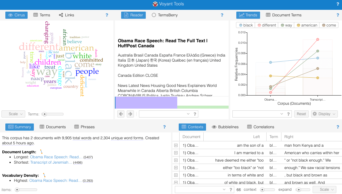
This is one such example: Now Analyze That! Comparing the Discourse on Race
http://hermeneuti.ca/now-analyze-that
And here is the missing analysis from that chapter, which I was able to put together since the authors included links to their original data sources (the two speeches they analyzed):
https://voyant-tools.org/?corpus=82e6708272392deafa79b7be752d10f3
And, just for fun, here is the Shakespeare Corpus in Voyant, showing the most frequent words and contexts throughout all of Shakespeare’s works:
http://voyant-tools.org/?corpus=shakespeare
Datawrapper.de
Datawrapper is a free tool to show data visualizations. You can create or upload your own datasets (usually via spreadsheets or CSV files) and edit the tables and graphs to your liking. Then the site will host your graph and you can embed it in other websites, including blog posts and social media. You can also create a free login to save, edit, and share your visualizations.
To try it out, find a dataset and upload it. (They have a few text datasets on their site; just click to start a new visualization and they will recommend something.) There are a lot of open datasets from government and other sources. CSV files tend to work best for uploading to Datawrapper. Check out:
https://datasetsearch.research.google.com/
To make a simple visualization, I took data from FRED and Yahoo! Finance to make a graph comparing median household income to the Dow Jones:
https://fred.stlouisfed.org/series/MEHOINUSA672N
https://finance.yahoo.com/quote/%5EDJI/history/
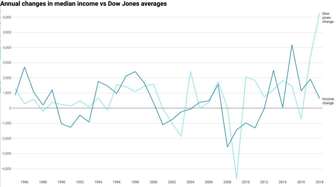
Here’s all of the data from the median household income compared to the Dow Jones:
https://datawrapper.dwcdn.net/ssl64/2/
Unfortunately, this graph doesn’t tell me much. All I see is a line representing Median Income, which is measured in USD, and a line representing the Dow Jones, which is represented in market “points.” So, comparing dollars to points doesn’t make sense. My Dow Jones dataset only has data from 1985 to the present, as well.
So I decided to cut off the comparison to 1985 to the present by limiting my datasets to the measurements provided on January first of each year from 1985 to the present. I also wanted to change the values displayed, so instead of comparing dollars to points, I decided to compare rates of change. I did this by creating a spreadsheet that found the difference between a given year and the year previous (basically subtracting 1985’s value from 1986, then 1986’s value from 1987, and so on). This showed me how much each dataset had changed from year to year, so I could compare the rise and falls of median income to the rise and falls of the Dow Jones.
Here is what that looks like for those data:
https://datawrapper.dwcdn.net/JzCaH/1/
Google Maps Custom
https://www.google.com/maps/about/mymaps/
The same Google Maps that allows everyone to find driving routes and restaurants also allows everyone to create their own custom maps. This means adding any kind of data based on location to show what’s most important to your digital humanities research project. For example, maybe you’re looking at the availability of health clinics in Atlanta, and their locations versus the locations of certain neighborhoods or demographics. You can plot all of that on a custom Google Map!
Rather than invent the wheel, I will link you to an excellent step-by-step way to work with Google Maps. This guide will show you how to import and edit data on Google Maps to make your own custom map with your custom datasets:
Tour Builder (Google Earth Custom)
https://tourbuilder.withgoogle.com/
This is similar to Google Maps, but allows for a more grandiose presentation. Google Earth also allows users to create custom maps… on a 3D globe instead of a flat map.
This guide will show you how to make custom maps in Google Earth:
https://www.google.com/earth/outreach/learn/storytelling-with-maps-using-tour-builder/
Here is an example of a great Google Earth Project that really captures the strengths of using Google Earth in digital humanities projects: “117 Days with JARE (Japanese Antarctic Research Expedition)”
Do you have questions about our recent news or upcoming events? Let us know.
Learn How